interview: Behind the Design for star trek: prodigy

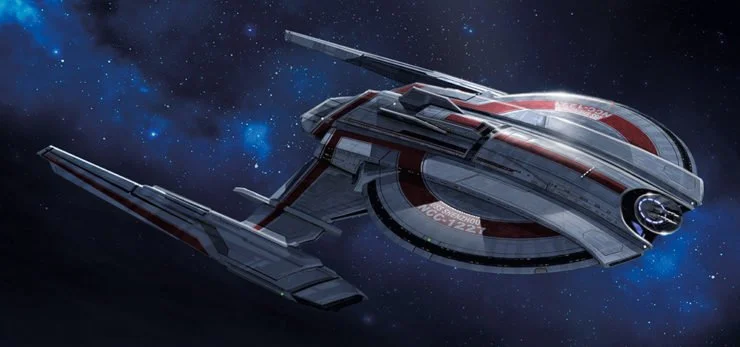
The USS Protostar in Star Trek: Prodigy
“This project was never just about designing a cool spaceship.”
It was about stepping into a world with decades of history, its own visual language, and a huge amount of audience expectation. From that foundation, the challenge was to contribute something new without losing the spirit that made the franchise so recognizable in the first place.
For NUEN Studio’s Lead Designer Gia Nguyen, designing the USS Protostar for Star Trek: Prodigy was exactly that kind of project.
The work initially began with the Command Bridge — the central control room of the ship. From there, the scope gradually expanded into many other parts of the vessel, so the design could be developed further for production.
The final design was not born from one perfect sketch. It came through many rounds of trial and error, testing, drawing over rough 3D blockouts, refining proportions, and constantly returning to one central question:
Does this still feel like Star Trek, while being fresh enough for Prodigy?
The result was the USS Protostar, one of the key designs of the series — a new Starfleet prototype that carried the legacy of the franchise while bringing a younger, more energetic feel to a new generation of viewers.
Later, the production design of Star Trek: Prodigy was also recognized at the Children’s & Family Emmy Awards, making the project even more meaningful for everyone involved.
—
Q: How did the project begin for NUEN Studio?
NUEN: The project began in 2019, when director Ben Hibon reached out to Gia Nguyen and NUEN Studio during the early development of Star Trek: Prodigy.
John Eaves concept art for Star TRek
At first, the brief focused on the Command Bridge of a new Starfleet prototype. At this stage, Ben also shared with the team early sketches by John Eaves — the legendary Star Trek designer and illustrator who has contributed to many familiar designs within the franchise over the years.
For NUEN Studio, that was both an advantage and a pressure. The advantage was that we were not starting from a blank page. Those sketches gave us a sense of the initial direction, the thinking behind the form, and the design language the project was moving toward.
But the pressure was also clear: when you are developing from a foundation like that, you have to be very careful. You need to understand what should be preserved, what can be pushed further, and how the final design can respect the spirit of Star Trek while still feeling new enough for Prodigy.
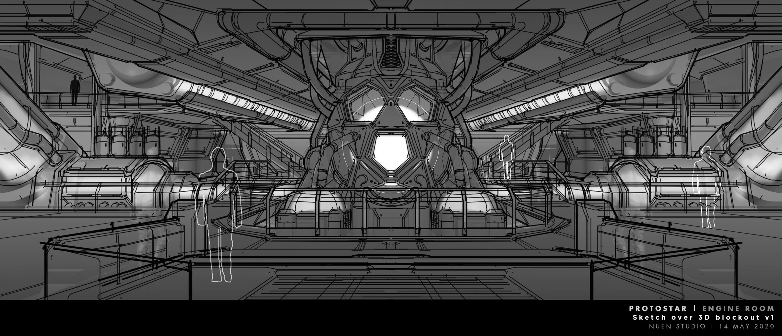
As the design process evolved, the scope expanded into other parts of the USS Protostar — from the exterior and hyper-warp system to the landing gear, ramp, decorative details, and interior spaces.
So it was no longer just about designing one important room. It became a process of helping define the entire ship.
—
Q: Gia, what was your first reaction when you knew this was a Star Trek project?
Gia: Honestly, I was excited — but there was pressure too.
Star Trek is a long-running IP with a very clear visual legacy. Even if you are not a hardcore fan, you can still recognize certain familiar elements: the ships, the bridge, the nacelles, the clean and technical feeling of Starfleet vessels. Those details all carry meaning.
So as an artist, I could not approach it like a completely new design. First, I had to understand the world that was already there.
At the same time, I still had to bring something new to it. If the design only repeated what already existed, it would not make the project better or show what the artist could contribute. But if it went too far, it might no longer feel like Star Trek.
Finding that balance is the real point of projects like this.
—
Q: What was the main design direction for the USS Protostar?
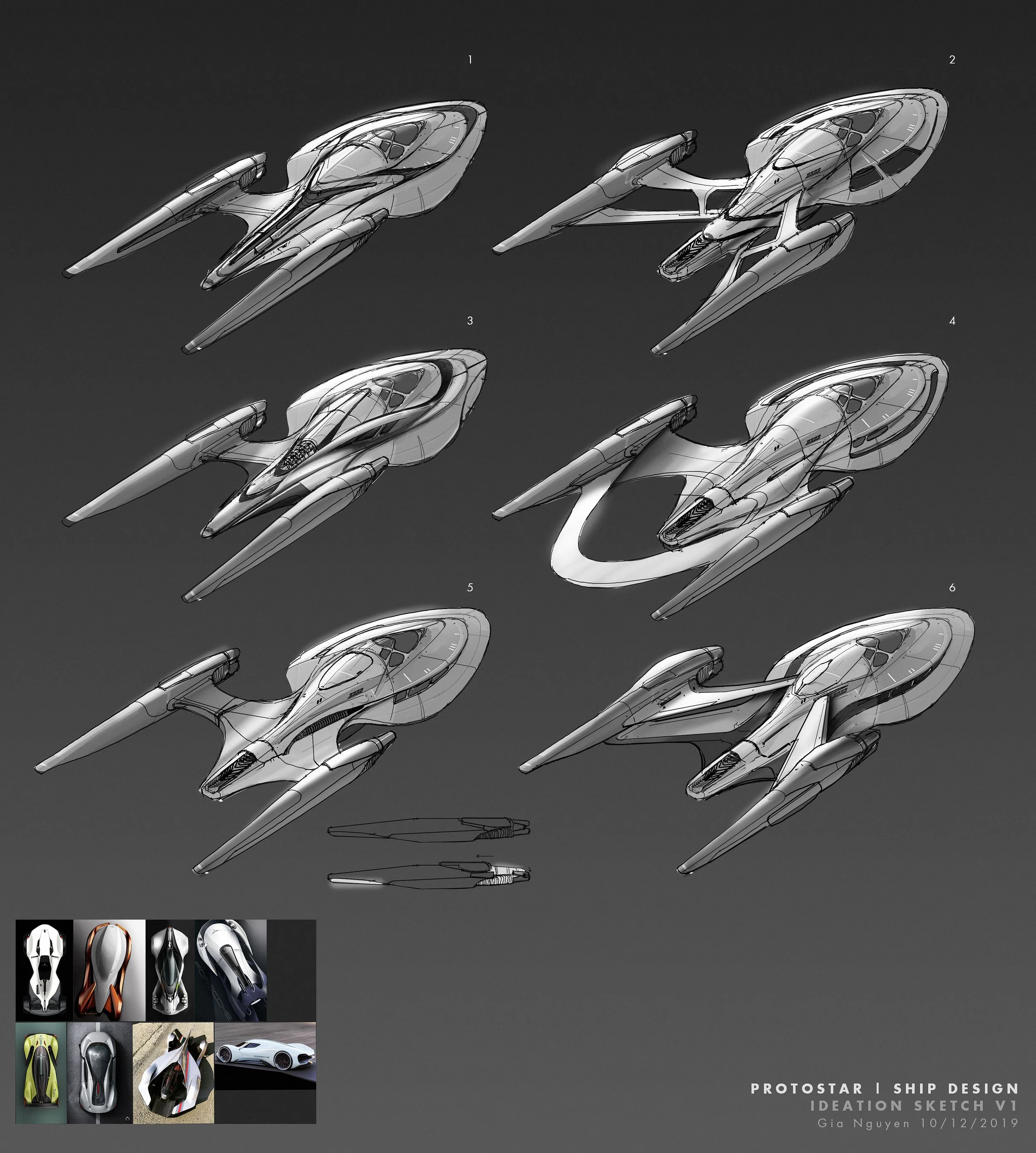
Gia Nguyen’s early sketches for the Protostar
NUEN: The Protostar needed to feel like it belonged to Starfleet, but not like a large classic Starfleet ship.
It was a compact, fast, modern, and experimental prototype. At the same time, it had to fit Star Trek: Prodigy — a series that introduces the Star Trek universe to a younger generation of viewers.
So we explored different ways to push the shape, body proportions, nacelle structure, and mechanical details further, while still keeping enough of the Star Trek DNA.
Most of the process was not about creating the best-looking version of the USS Protostar. The more important goal was to find the version that felt right for the story of this series.
—
Q: What was the trial-and-error process like?
Gia: It was really about trial and error — and not repeating the same mistake twice.
From the early sketches and brief by John Eaves that Ben Hibon shared with us, we started by reading the direction of the design: what part of the Starfleet spirit should be kept, what could be developed further, and where there was room for the Protostar to have its own identity.
After that, we worked with rough 3D blockouts, drawing over them to test the form, proportions, silhouette, and design details. This helped the team view the ship from multiple angles and quickly understand what was working and what was not.
Some sketches leaned more toward the existing Star Trek language. Others pushed the ship into a sharper, more experimental direction. There were also ideas that looked good as sketches, but once placed in the real context of the project, they no longer felt right.
That is a very normal part of concept design. Sometimes you need to go through several wrong options before you understand what the right one should look like.
The final direction came from that process of selection — keeping what served the story, removing what was unnecessary, and refining the design until the ship felt clear, convincing to the artist first, and then to the client.
—
Q: How did Ben Hibon influence the design direction?
NUEN: Ben had a very clear sense of what the ship needed to feel like: fast, cinematic, modern, but still emotionally connected to Star Trek.
The idea of the third nacelle and the hyper-warp system was a very important part of that vision. They gave the Protostar its own identity and separated it from a more traditional Starfleet ship. Whether intentional or not, even the name “Protostar” feels close to “prototype,” which reflects the experimental nature of the ship’s design.
What made the collaboration interesting was the openness to exploration. This was not a process of simply executing one fixed image from the start. It was about trying ideas together, reviewing them, responding to feedback, and gradually finding the strongest direction.
—
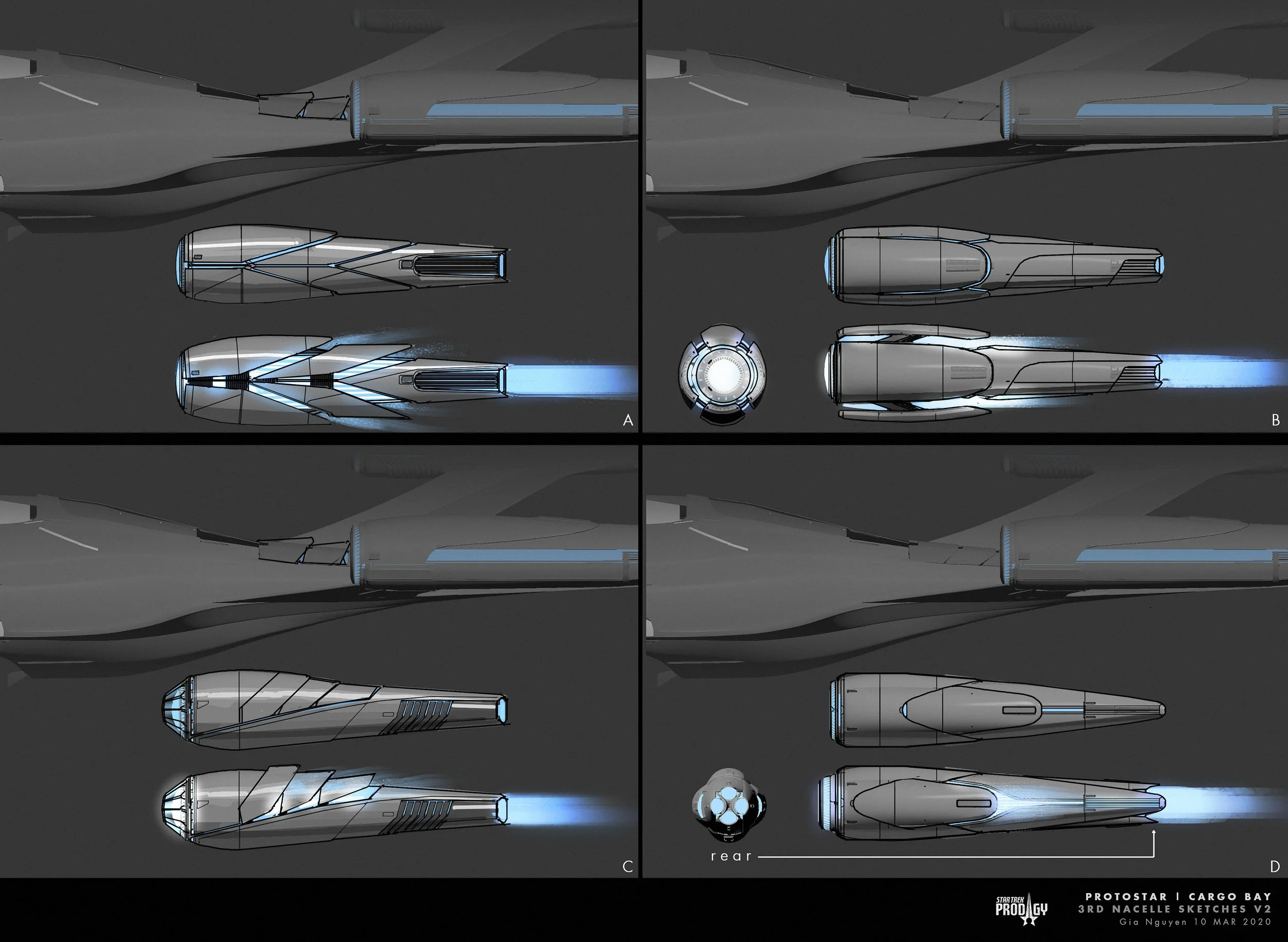
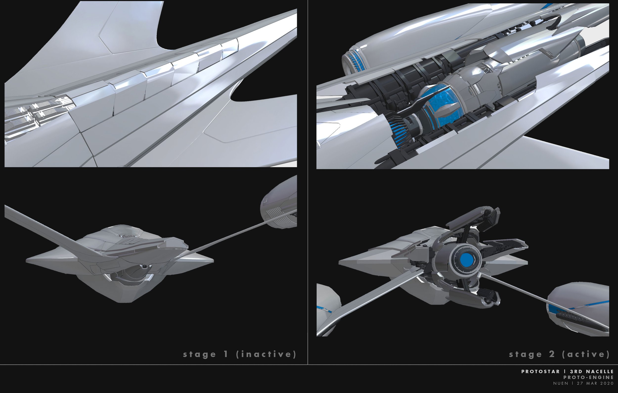
Q: The third nacelle became one of the ship’s most recognizable features. How did you approach that detail?
Gia: In Star Trek, the nacelle is not just a decorative element. It is a very important part of the franchise’s visual language.
So adding a third nacelle needed to have a clear reason. It had to support the idea that the Protostar was an advanced prototype with a special hyper-warp capability.
We explored how to integrate this third nacelle into the body of the ship, how it would activate, and how the moving parts could feel both cinematic and mechanically logical.
The goal was to avoid “sci-fi movement” that only looked cool. Every mechanical detail needed to suggest function, energy, and speed.
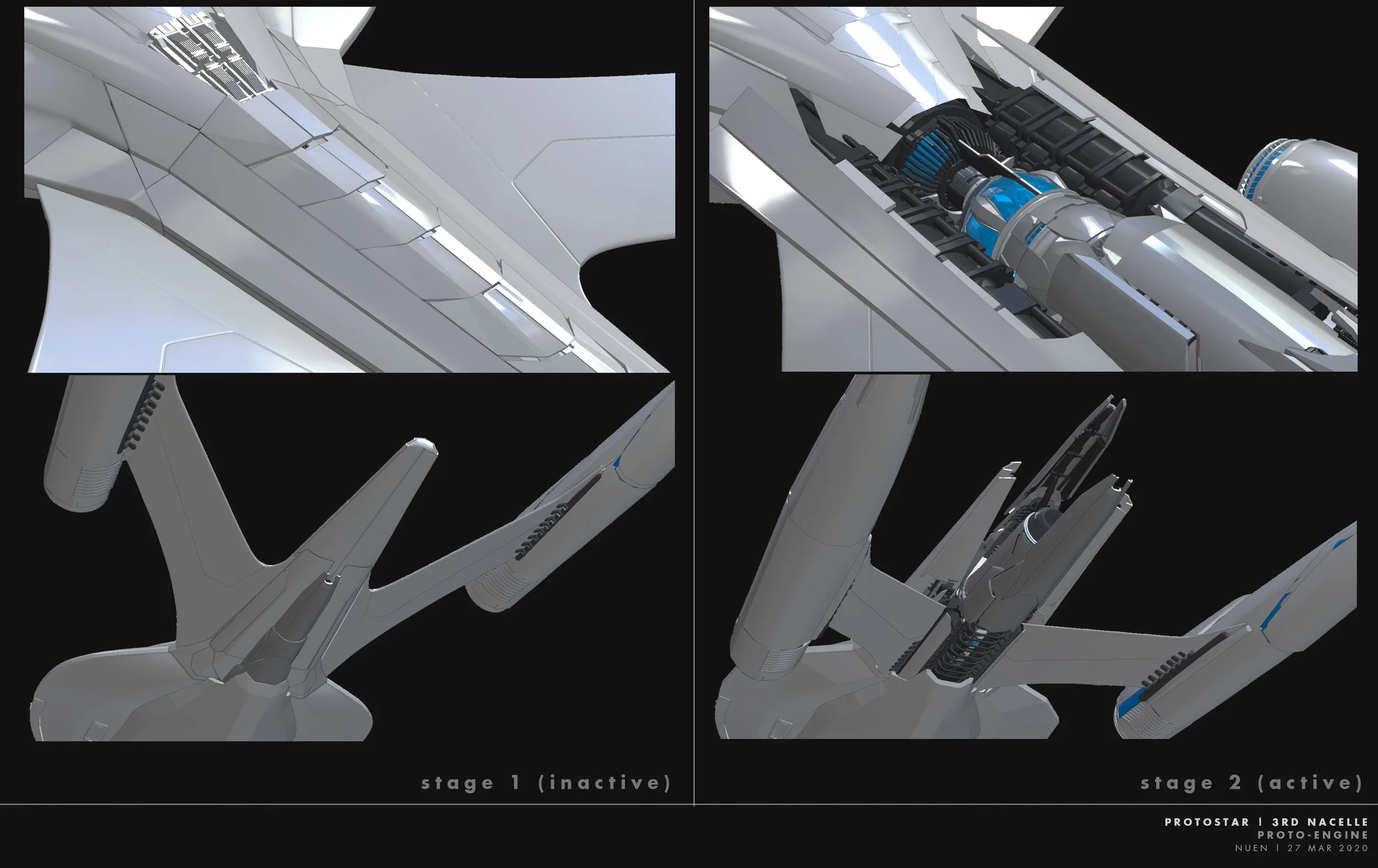
The “Proto Engine” early development
—
Q: Why was the Command Bridge so important?
NUEN: In terms of how the ship operates, the bridge is the brain of any Star Trek vessel.
It is where the crew comes together, where the captain’s chair sits, and where many important story moments happen. So the space needed to feel iconic, but still fresh enough for Prodigy.
Starting from the bridge also gave the project an inside-out design logic. We were not only designing the outer shell of the ship. We also had to think about how that space would feel for the characters and for the audience.
The layout, the captain’s chair, the surrounding control panels, the glass looking out into space, the lighting, and the overall atmosphere of the room all had to support the importance of that space.
Early development sketch of the Command Bridge
The Captain’s chair sketch
—
Q: Gia, what was the hardest part of designing the USS Protostar?
Gia Nguyen: For me, the hardest part was knowing when to push an idea further and when to hold it back.
In personal projects, you can follow your instinct more freely. But with a project like Star Trek, every design decision sits inside a much bigger world. The ship has to serve the story, the director’s vision, the production team, the animation process, and the audience — many of whom already understand this universe very well.
So the work required a lot of self-questioning, followed by a lot of refinement.
You try an idea and ask yourself: does this still belong in this world? Is it too much? Is it too familiar? Does it make the story better? Does it support production?
That process is very important. It makes the work less about personal taste and more about how well you understand the world of Star Trek — and from there, how you solve the design problem correctly.
USS Protostar’s Command Bridge final design
—
Q: How did the team approach smaller details like the landing gear, ramp, and props?
NUEN: Those details are what make the design feel real.
The landing gear had to make the audience believe the ship could actually land. The ramp and entry system had to connect logically with the cargo bay. The smaller details and interior elements also needed to share the same design language as the rest of the ship.
In production design, looking good is not enough. The design needs logic.
Where does the landing gear fold? How do the characters enter the ship? Does this object feel like something that can actually be used? Can the audience quickly understand what that detail is for when they see it on screen?
These questions helped push the design beyond a beautiful concept image, turning it into something that could work within the story and the production process.
—
Q: What do you consider the biggest achievement of this design?

Production designer Allessandro Taini picking up his Emmy for Prodigy
Gia: For us, the biggest achievement was that the Protostar could work on many layers at the same time.
As a design, it connected to the legacy of Star Trek without becoming a copy of what already existed. As one of the central ships of the series, it had enough character for the audience to remember. And from a production point of view, the ship had a clear operating logic — from the bridge and exterior form to the warp system, ramp, landing gear, and smaller mechanical details.
That is not always easy to achieve. A design can look very impressive in a still image, but fall apart when it has to appear in animation, across multiple camera angles, in different story situations, and through different stages of production.
With the Protostar, the goal was always to create a ship that felt functional, cinematic, and most importantly, true to the spirit of the series.
The fact that the production design of Star Trek: Prodigy was later recognized at the Children’s & Family Emmy Awards made the project even more meaningful. It showed that the design work did not only serve its role in production, but also contributed to the overall identity and quality of the show.
—
Q: Looking back, what does this project mean to NUEN Studio?

Protostar Cargo Bay sketches
NUEN: This project is meaningful to the studio in many ways.
Professionally, it allowed us to work across many areas of design: vehicle design, environment design, props, mechanical thinking, cinematic composition, and world-building.
On a broader level, contributing to a major global IP as a studio from Vietnam was also a special experience. Projects like this remind us that strong design thinking and clear collaboration can travel far beyond geography.
It also reminded us that trying to create a perfect design from the very beginning is pointless. A strong design has to be shaped through exploration, feedback, testing, and refinement.
—
Q: Gia, what stayed with you after this project?
Gia Nguyen: The feeling that maybe I can take on anything.
With a franchise like Star Trek, you know that many artists and designers have built this world before you. My job was not to replace what came before. It was to understand it, respect it, and contribute what I could.
This project also reminded me that good design is not just about showing your personal taste. It is about listening to the story, understanding the world you are stepping into, and finding the right place for your ideas to exist within that world.
—
Thank you for revisiting this project with us.
SPECIAL THANKS
To director Ben Hibon, the teams at Nickelodeon Animation and Paramount Pictures, and everyone who helped bring Star Trek: Prodigy to life — we are grateful to have been part of the journey.